Creating a professional-looking document in Microsoft Word is not only about typing correct information; it is about presentation, structure, clarity, and consistency. A well-prepared document reflects seriousness, credibility, and attention to detail, whether it is a resume, report, assignment, proposal, or official letter. Many people use Microsoft Word daily, yet only a small number truly understand how to use its features to make documents look polished and refined. With the right approach, anyone can transform a simple file into a professional-quality document.
The first step toward professionalism is proper planning before typing. Decide the purpose of the document and the audience who will read it. A business report needs a formal tone, while a study project may require clarity and structured explanations. Once the goal is clear, choosing the right page setup becomes easier. Adjusting margins, paper size, and orientation at the beginning prevents layout issues later. Standard margins create balance and white space, making content easier to read and visually appealing.
Font selection plays a major role in the overall impression. Professional documents avoid decorative or overly stylized fonts. Clean and readable typefaces such as serif or simple sans-serif styles maintain seriousness. Font size should be comfortable for reading, neither too small nor too large. Consistency is crucial; using too many fonts in one document makes it look messy and unorganized. A single font for body text and a slightly different one for emphasis is usually enough.
Alignment and spacing strongly affect readability. Paragraph spacing should be uniform throughout the document so that every section looks connected. Alignment should match the document’s purpose; for example, left alignment is commonly used for formal writing because it is easy on the eyes. Justified text can look elegant but must be used carefully to avoid uneven spacing between words.
Using styles instead of manual formatting is one of the most important habits for creating professional documents. Styles allow you to maintain consistency in headings, subheadings, and normal text. When styles are applied correctly, the entire document can be updated instantly with a single change. This not only saves time but also ensures uniform design across all pages. Styles also help in creating automatic tables of contents, which add to the professional quality of longer documents.
Headings and logical flow guide readers through the content smoothly. Even without visible section titles, the text should progress in a natural and organized manner. Each paragraph should focus on one idea and connect clearly to the next. Avoid overly long paragraphs, as they can overwhelm readers. Balanced paragraph length improves comprehension and keeps the document visually clean.
Page numbering and headers or footers add structure and identity. Including page numbers is essential for multi-page documents, especially reports or manuals. Headers and footers can contain document titles, author names, or dates, providing context without distracting from the main content. These elements should remain simple and subtle to maintain a professional tone.
Tables and lists are powerful tools when used wisely. They help present information clearly and efficiently. Instead of writing long sentences, structured lists can make points easier to understand. Tables should have clear alignment and minimal borders to avoid clutter. Proper spacing inside tables improves readability and keeps the layout neat.
Images, charts, or graphics should only be included when they add value. Every visual element must be clear, high quality, and relevant. Poorly placed or unnecessary images can reduce the professional feel. Align visuals properly with text and ensure they are sized proportionally. Adding captions when necessary helps readers understand the purpose of each visual.
Careful review of the document is a crucial final stage, as overlooking errors can reduce clarity and credibility. Spelling mistakes, grammatical errors, and inconsistent formatting can damage credibility instantly. Microsoft Word provides built-in tools for spelling and grammar checks, but manual review is equally important. Reading the document slowly or reviewing it after a short break helps catch errors that automatic tools might miss.
Consistency in language and tone maintains professionalism. Switching between casual and formal language can confuse readers and weaken impact. Choose a tone that matches the document’s purpose and maintain it from beginning to end. Avoid unnecessary jargon unless the audience is familiar with it. Clear and straightforward language always leaves a better impression.
Saving and exporting the document correctly is also part of professional preparation. Using a clear file name makes it easy to identify and share. When sending the document to others, exporting it as a PDF can preserve formatting and prevent unwanted changes. This ensures the document appears exactly as intended on different devices.
Finally, professionalism in Microsoft Word comes from attention to detail. Small elements such as uniform indentation, consistent bullet styles, proper use of white space, and clean formatting collectively make a big difference. A document that looks organized and easy to read shows respect for the reader’s time and reflects positively on the creator.
By understanding these principles and applying them carefully, anyone can create documents that look refined, reliable, and impressive. Microsoft Word is a powerful tool, and when used thoughtfully, it allows users to present their ideas with confidence and clarity. A professional document is not created by chance; it is the result of deliberate choices, consistency, and a clear focus on quality.
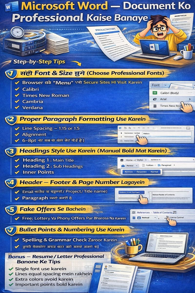
Font hi document ka face hota hai. Agar font childish ya stylish hoga toh document professional nhi lagega.
Best Professional Fonts
- Calibri (Default & safe choice)
- Arial
- Times New Roman
- Cambria
- Verdana
Recommended Font Size
• Title: 16–20 • Headings: 14–16 • Paragraph text: 11–12
Kabhi yeh fonts use na karein
Comic Sans Brush Script Decorative ya Stylish fonts
Kyun? Kyuki yeh readable nahi hote — corporate aur academic world mein accept bhi nahi hote.
Step 2 — Proper Paragraph Formatting Use Karein
Professional document ka ek golden rule hota hai:
Text na chipka hona chahiye, na hi bekaar spaced out
Ideal formatting settings:
• Line spacing ko 1.15 ya 1.5 par set karein
• Alignment Justify rakhein
• Paragraph ke baad 6–8 pt spacing add karein
Steps:
- Home tab se
- Paragraph
- Paragraph Spacing and Line
Justify ka benefit:
Text left aur right dono edges se straight dikhai deta hai, jisse document professional aur balanced lagta hai.
Step 3 — Headings Styles Use Karein (Manual Bold Mat Karein)
Most log heading ko bas bold kar dete hain — lekin ye galat habit hai.
Use This Instead:
Home → Styles → Heading 1, Heading 2, Heading 3
- Heading-1 → Main Title
- Heading-2 → Section Title
- Heading-3 → Sub-points
Fayda kya?
- Ek jaisi styling rahegi
- Table of Contents auto ban jayega
- Document structured dikhega
- Screen readers & indexing ke liye perfect
Step 4 — Header, Footer Aur Page Numbers Zaroor Lagayein
Professional document kabhi page number ke bina nahi hota.
Use For:
- Reports
- Projects
- Assignments
- Legal Docs
Add karne ka tareeka:
Insert → Header/Footer → Page Number
Header mein aap likh sakte hain: • Project Name • Company Name • Report Title
Footer mein: • Page Number • Date • Confidential Note
Step 5 — Table of Contents (TOC) Add Karein
Agar document bada ho toh Table of Contents zaroor hona chahiye.
Steps:
References → Table of Contents → Automatic
Aur sab headings automatically detect ho jayengi.
Professional Lagta Hai Because:
- Reader ko navigation easy hota hai
- Document organized dikhta hai
- Research papers / Projects ke liye must-have hai
Step 6 — Margins Aur Page Layout Sahi Set Karein

Most log page margin ko touch nahi karte — lekin ye bahut important hai.
Standard Margin:
Layout → Margins → Normal (1 inch all sides)
Paper Size
A4 — almost sab jagah standard hai
Step 7 — Bullet Points Aur Numbering Use Karein
Jahan list ho, wahaan list dikhni bhi chahiye 👍
Best use cases:
- Features list
- Key points
- Steps
- Notes
Isse reader ko document samajhne mein asaani hoti hai.
Step 8 — Spelling & Grammar Check Zaroor Karein
Professional document mein spelling mistakes bilkul nahi honi chahiye.
Kaise check karein?
Grammar aur Spelling check karne ke liye :
karne Press F7
Benefit Bonus
MS Word sentence correction aur improvement ke liye suggestions bhi provide karta hai.
Step 9 — Professional Writing Style Follow Karein
Sirf formatting nahi — writing style bhi professional honi chahiye.
Avoid karein:
- Hinglish in formal docs
- Short forms (u, r, btw)
- Slang
- ALL CAPS texting style
Follow karein:
- Simple English/Hindi
- Short sentences
- Clear point-wise explanation
Step 10 — Document ko Visually Clean Rakhein
Over-styling se bachna bahut zaroori hai.
Avoid:
- Too many colors
- Different fonts
- Extra bold / underline
- Random icons & emojis
Use only:
• Proper spacing • Good headings • Alignment • Minimal styling
Resume / Letter Ko Professional Kaise Banayein
Resume aur Letter Word ke sabse common uses hain — aur yahi sabse important bhi.
Resume Ke Rules
Recommended Fonts
Use simple & professional fonts like:
• Calibri
• Arial
• Times New Roman
Font size 11–12 rakhein.
Resume ke Main Sections
resume mein yeh headings zaroor include karein Chayea :
- Contact and Name Details
- Career Objective
- Key Skills
- Work Experience / Projects
- Education
- Certifications (agar ho)
Kin cheezon se bachein
Resume ko professional rakhne ke liye in cheezon ka use na karein:
• Extra colors
• Images
• Fancy / decorative borders
• Long paragraph-style resume format
Letter Formatting Rules
Left aligned text only
1.5 spacing best hai
Standard format:
Sender Address Date Receiver Address Subject Body Regards

Shortcut Keys Jo Kaam Ko 2x Fast Kar Dete Hain
| Shortcut | Kaam |
|---|---|
| Ctrl + B | Bold |
| Ctrl + I | Italic |
| Ctrl + U | Underline |
| Ctrl + A | Select All |
| Ctrl + S | Save |
| Ctrl + Z | Undo |
| Ctrl + Y | Redo |
| Ctrl + P | |
| Ctrl + F | Find Text |
| Ctrl + H | Replace |
In shortcuts ko agar aap regular use karoge toh productivity double ho jayegi.
Professional Look Ke Final Rules (Most Important)
Always use 1 font type
Keep spacing equal
Bold only important phrases
Avoid bright colors
Keep margins default
Proofread before sharing
Result Kya Milega?
In sab steps ko follow karne ke baad aapka document:
Clean Stylish Professional Readable Well-structured
ban jayega — jo teachers, clients, HR, manager sab par strong impression chhodta hai.
Real-Life Use Cases
Ye guide use hoti hai:
- School assignments
- College projects
- Office reports
- Business proposals
- Professional resumes
- Job cover letters
- Freelancing work
- Blogging
- Content writing
Matlab Microsoft Word ko seriously use karne walon ke liye yeh GOLD hai.
Common Mistakes Jo Log Karte Hain
- Different-different fonts use karna
- Text ko center align kar dena
- Line spacing na rakhna
- Paragraph jamakar likh dena
- Spelling check na karna
- Headers–Footers skip kar dena
Agar aap yeh sab avoid kar loge toh document automatically premium dikhega.